LED Color Temperature Comparison: 3000K vs 4000K vs 5000K vs 6500K

Table of Contents
The Ultimate Color Temperature Comparison Chart
Detailed Color Temperature Comparisons by Application
3000K vs 4000K (Commercial & Office Lighting)
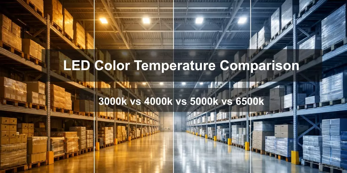
4000K vs 5000K (Warehouse & Industrial Lighting)
5000K vs 6500K (Sports & High-Precision Applications)
5700K vs 6500K (Outdoor Security & Monitoring)
Why Color Temperature Stability Matters in Real-World Use?
Intro
Choosing the wrong LED color temperature is not a minor technical detail—it can directly impact daily operations and long-term ROI.
In commercial offices and warehouses, the wrong CCT often leads to reduced productivity, faster eye fatigue, and frequent complaints from employees. In industrial or outdoor environments, it can create safety risks by reducing contrast and visibility. For sports venues, an unsuitable color temperature may even cause broadcast issues, such as unnatural skin tones or overexposed visuals on camera.
This is why color temperature should never be selected by “what looks brightest” alone.
This guide is designed for commercial, industrial, sports, and outdoor lighting decision-makers who need clear, practical answers. Instead of definitions, it focuses on real-world comparisons—showing how different color temperatures perform in specific applications.
With a decision-oriented comparison chart and scenario-based breakdowns, this article helps you quickly identify the most reliable color temperature for your environment, not just on day one, but over years of use.
The Ultimate Color Temperature Comparison Chart
The chart below is not meant to explain what Kelvin values are—it is built to help you make faster, safer lighting decisions.
Rather than comparing color temperature in isolation, this chart connects each Kelvin range to how light is actually perceived and used in real spaces. It highlights not only advantages, but also potential risks when a color temperature is misapplied.
To use this chart effectively, focus on more than the “K” number. Look at how visual perception, typical applications, and long-term usability align with your project goals.

The comparison chart includes:
l Color Temperature (K)
l Visual Perception
l Typical Applications
l Pros
l Cons
l Risk if Misused
This structure ensures you are not just choosing a color temperature—but choosing the right one for your specific environment.
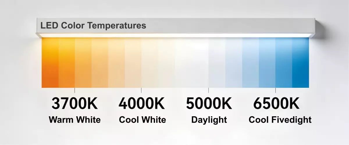
Color Temperature (K) | Visual Perception | Typical Applications | Pros | Cons | Risk if Misused |
3000K (Warm White) | Warm, soft, yellow-tinted light | Hospitality areas, restaurants, lounges, residential zones, decorative outdoor spaces | Creates comfort and relaxation; reduces glare; visually pleasing for long stays | Low alertness; poor contrast for detailed tasks | Reduced productivity in workspaces; insufficient visibility in safety-critical areas |
4000K (Neutral White) | Balanced white, natural tone | Offices, classrooms, retail spaces, light industrial areas | Good visual comfort; supports focus without fatigue; widely accepted standard | Less stimulating than higher CCT; not ideal for high-precision tasks | Can feel dull in high-activity or inspection environments |
5000K (Daylight White) | Crisp, bright, daylight-like | Warehouses, factories, sports facilities, large commercial spaces | Enhances contrast and visibility; improves task accuracy; supports alertness | May feel harsh in long-stay areas; higher glare risk | Visual fatigue if overused indoors; discomfort complaints |
6500K (Cool Daylight) | Very cool, bluish white | Outdoor security areas, ports, high-mast lighting, broadcast-focused sports venues | Maximum visibility; strong contrast; camera-friendly lighting | Least comfortable for human eyes; unnatural appearance | Eye strain; complaints; unsuitable for offices or retail; over-illumination issues |
Read more: If you's like to learn more about it, here is a blog provides a detailed explanation of what LED color temperature is.
Detailed Color Temperature Comparisons by Application
Color temperature decisions should never be made in isolation. The same Kelvin value can perform very differently depending on where and how it is used.
In the following sections, we compare common LED color temperatures by real application scenarios, not by abstract definitions. Each comparison starts with the practical decision context—how long people stay in the space, what tasks they perform, and what visual risks may appear over time.
Rather than ranking color temperatures as “good” or “bad,” these comparisons explain why one option works better than another in specific environments. This approach helps lighting planners and decision-makers choose a solution that supports productivity, comfort, safety, and long-term usability—rather than relying on brightness or appearance alone.

3000K vs 4000K (Commercial & Office Lighting)
In commercial and office environments, color temperature decisions should start with one question: how long people stay and what they need to do while they are there.
For workspaces where employees spend long hours on screens or detailed tasks, visual clarity and alertness become critical. In this context, 4000K neutral white lighting provides a balanced appearance that helps maintain focus without feeling harsh. It supports sustained productivity, especially in offices, shared workspaces, and meeting rooms with extended daily use.
By contrast, 3000K warm white lighting creates a softer, more relaxed atmosphere. While this can improve visual comfort and emotional warmth, it may reduce perceived sharpness during long working hours. However, this softer tone works well in reception areas, lounges, and customer-facing spaces where comfort and ambiance matter more than task performance.
In practice, many commercial projects combine both.
4000K is often used in primary work zones, while 3000K supports hospitality-oriented or short-stay areas where customer perception plays a larger role than sustained alertness.
4000K vs 5000K (Warehouse & Industrial Lighting)
In warehouses and industrial facilities, choosing the wrong color temperature carries one of the highest operational costs. Lighting here affects safety, accuracy, and worker endurance over long shifts.
4000K lighting offers a neutral visual environment that reduces eye strain during extended working hours. It allows workers to clearly see aisles, equipment, and floor markings without excessive glare. For facilities operating multiple shifts or overnight, this balance often improves comfort and consistency.
5000K lighting, on the other hand, delivers higher perceived contrast and sharper detail. This can be an advantage in areas where inspection accuracy, labeling, and precision tasks are critical. However, when used across large spaces or for long durations, it may increase visual fatigue if not properly designed.
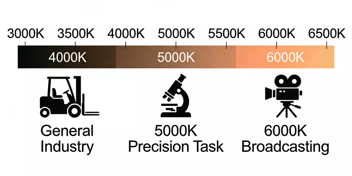
Many operators adopt a zoned approach—using 4000K for general circulation and work areas, while applying 5000K selectively in inspection lines or quality-control zones.
For a deeper technical breakdown, see our 4000K vs 5000K warehouse lighting case study.
5000K vs 6500K (Sports & High-Precision Applications)
In sports venues and high-precision environments, color temperature affects not only visibility, but also how the space appears on camera.
5000K lighting, often close to natural daylight, provides balanced illumination that works well with camera sensors. It preserves skin tones, reduces overexposure, and delivers consistent visuals for live broadcasts and replays. This is why many professional sports facilities operate around the 5000K–5700K range.
6500K lighting appears brighter to the human eye but introduces a cooler, bluer tone. While this can increase perceived sharpness, it may also cause glare and color distortion on camera. In broadcast settings, this often results in harsher visuals and increased post-processing demands.
For environments where both athletes and cameras matter, a balanced daylight range is usually more reliable than pushing brightness alone.
5700K vs 6500K (Outdoor Security & Monitoring)
In outdoor security applications, brighter lighting does not always translate to better monitoring outcomes. The key factor is long-term visual performance.
5700K lighting offers a daylight-balanced appearance that improves facial recognition and object identification without excessive glare. It supports security personnel who must monitor spaces for extended periods, helping reduce visual fatigue during long shifts.
6500K lighting, while appearing brighter, can create harsh contrasts and reflective glare on pavement or vehicles. Over time, this may reduce monitoring accuracy and increase eye strain, especially in parking lots and perimeter zones that require constant observation.
For most security-focused projects, a balanced daylight range delivers more consistent results than maximum apparent brightness.
Why Color Temperature Stability Matters in Real-World Use?
Most color temperature comparisons focus only on how light looks on day one. In real-world projects, this approach often fails.
A common industry problem is CCT drift. As LED fixtures operate under high power and heat, traditional phosphor materials—typically phosphor powder mixed with silicone—degrade over time. This causes color temperature shifts, brightness loss, and inconsistent visual output. A 5000K fixture may gradually appear cooler or uneven, undermining the original lighting design and making any initial comparison meaningless.
The root cause lies in heat and material limitations. Poor thermal conductivity traps heat around the light source, accelerating phosphor aging and reducing internal quantum efficiency. Under continuous operation, especially in industrial, outdoor, and high-power applications, this instability becomes unavoidable.
CeramicLite addresses this challenge with Fluorescent Transparent Ceramic (FTC) LED chips, a next-generation replacement for traditional phosphor systems. FTC materials deliver exceptional thermal stability, high transmittance, and strong resistance to corrosion and aging. With internal quantum efficiency above 98%, thermal conductivity up to 10 W/m·K, and luminous attenuation below 5% over 100,000 hours (LM-80 verified), color temperature remains consistent even under extreme thermal loads.
This stability ensures that color temperature comparisons remain valid—not just at installation, but throughout the fixture’s service life.
Conclusion
There is no universal “best” color temperature. What works in an office may fail in a warehouse, and what looks bright outdoors may cause fatigue or glare over time.
Effective color temperature selection depends on application requirements, operating hours, visual tasks, and long-term stability—not just initial appearance. A comparison only has real value when the light source can maintain its performance year after year.
By choosing color temperatures based on real-world use and pairing them with stable, industrial-grade LED technology, decision-makers can achieve better comfort, safety, and return on investment.
If you need help selecting the right color temperature or designing a lighting solution for your specific application, professional consultation and photometric planning can make the difference between a good installation and a reliable one.
_thumb.jpg)